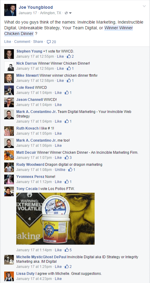
When I decided I wanted to start something I had no clue what to name it, so I came up with a few names and took to facebook to ask my family and friends to help me pick a name. As you can see the entry I put mostly as a joke was the clear winner, which stoked my imagination and led me to believe the brand was different enough it just might stand out.
I had no clue what I was about to get myself into, how difficult it would be to use a popular phrase like “Winner Winner Chicken Dinner” and turn it into a respectable brand. It’s no lie that Winner Winner Chicken Dinner is a kind of funny name. Some have said it reminds them of something odd or strange, others have said it has a college-esque ring to it. No one has any clue what the brand should look like.
Recently I took to my friends in the industry and asked them simple questions about what the brand Winner Winner Chicken Dinner evoked in their mind. The responses were almost completely universal, it reminded them of a restaurant. Obviously that is not what we are going for here.
I have built other brands for myself in the past and settled on imagery and messaging quite easily. For RadioRevolt.com we used crossed pistols, black and red colors, and skulls. For MMOMarket.net we went with blues and a sword slicing through the logo. For GamersTube it was the outline of a modern LED tv with old school joysticks connected to it. Building the brand imagery and identity never took that long, a few questions, a little research, and the right graphics person and voila the brands were built and launched quickly.
Then comes Winner Winner Chicken Dinner, a marketing strategy agency with a funny name and a name that for some reason reminds everyone I know of a chicken restaurant. To test my colleagues response of a chicken restaurant I went to Fivver.com (hold on to the eye rolls) to see what the logo designers there could think up. I didn’t expect anything awesome, but was curious if the brand being identified with a restaurant would resonate with this group as it had with my friends and colleagues. The designers were told to use any imagery or color they wanted and that the logo was for a marketing agency. The results, were perhaps not surprising.
As you can see they all (except for one) seem to follow the same pattern, a chicken image from Google/Bing Image search or some icon site along with red and yellow colors – things you might see on a Chicken Express or Chick-fil-a sign. Not a marketing brand at all.
So far we’ve learned what exactly the current brand evokes and while it’s not what we want, it’s a good thing. We can use this data to guide us on a path to creating branding material that evokes the right message. We’ve used this information to develop a plan for a new run at developing the logo and brand messaging, to do everything possible to remove the alignment with a chicken restaurant and instead build and develop the brand we want for a marketing agency, a brand that evokes completing the impossible, winning, and doing great work.
This is Part 1 of an X Part series about how we decided on our branding, messaging, and imagery. Hopefully it’s only a 2 part series, but who knows…


